OVERVIEW
Role: UX Strategy, Ideation, Sketching & wireframing, Branding, UI Design, User Testing, Iteration
Timeline: 5 days sprint + 2 weeks redesign
Refresh is the solution for a design sprint on the topic of solving the food waste problem. The Challenge was to come up with a prototype in 1 week with a group of 4 people. Our group decided to focus on food waste at home and how to minimize the amount of leftover raw ingredients that are being wasted by each household.
Refresh is a food waste management app that keeps track of all the products and ingredients each household bring home. It helps the family to assess freshness of products and also suggests recipes to help them repurpose leftover ingredients.
PROTOTYPE
Click to Interact!
DAY 1 - Define Problem & Goal Setting
Food waste is an economical and environmental problem that is bigger than most people think.
- In Toronto, Single family households discard 275 Kilos of food waste each year
- 31 billion worth of food is wasted in Canada each year.
- Approximately 40% of food produced yearly in Canada
- 47% of food wasted in Canada occurs at home
Our goal is to mitigate food waste from households through behavioral change.

DAY 2 - User Interview Insights & Mapping
How is food being wasted at home? To answer the question, we conducted user interviews and surveys from 18 participants.
We found out that:
- People do not know how to assess the freshness of produce - Good products get thrown away based on “physical trait”
- Cost is a big factor in determining how much they buy - Bulk buying due to cheaper costs
- People tend to buy more food when they still have perfectly good food at home - Does not plan ahead = Spontaneous shopping
- Food gets forgotten in the fridge - “Out of sight, out of mind” thinking
We then mapped out a journey of how groceries were brought home and thrown out by a typical user. Sticky notes were attached to indicate the areas of opportunities.

DAY 3 - Sketch & Decide
After looking at different inspirations. We as a group started to brainstorm possible ideas and sketch out designs. Each member was able to present their ideas and the final decisions were made through a silent voting of the best ones. The end solution was created by merging everybody's ideas into one masterpiece.

DAY 4 - Wireframes & Prototype
This is the final result of our first prototype. We want to help the users to track food usage at home, educate them on how to assess the freshness of food and give them creative suggestions to repurpose leftovers.

DAY 5 - Usability Testing & Iterations
The entire day 5 was dedicated to user testings. We conducted 5 rounds and refined the designs according to the feedback. The main takeaways from the testings are:
- Refine the reward system so that users have more incentive to come back and log information (bring rewards to the forefront)
- Adjust the buttons and the overall flow
- Finding a unique way to promote logging inventory info without task feeling like a chore
A STEP FURTHER - Redesign & Hi-fidelity Screens
After the sprint was over, I realized that there are a lot of areas that could be improved for our original prototype. Since the initial prototype was done in a fast-paced sprint process, we did not focus on the details of the interface and the task flow. I decided to explore it further and also redesign the user interface by giving it a more interesting style and brand identity. I also filled in the gaps that were missing during the design sprint. The below hi-fidelity screens are my redesigns.


Key Takeaway of a Design Sprint
Time Management: I learned that spending a long time on a project does not necessarily mean it will bring the best result. Sometimes it’s really easy to get stuck with the unnecessary details and find myself running in circles. By forcing myself to move on to the next step even if the current stage is not perfect not only speeds up the workflow, but also helps me to gain new insights by looking at the problem through other different angles.
Teamwork: It also brings a team together by aligning the goals at the beginning and encourages the team to work towards the clearly defined goals by constantly inspiring and motivating each other.
Selected Works

BoostOn-Campus Order Ahead Mobile Application
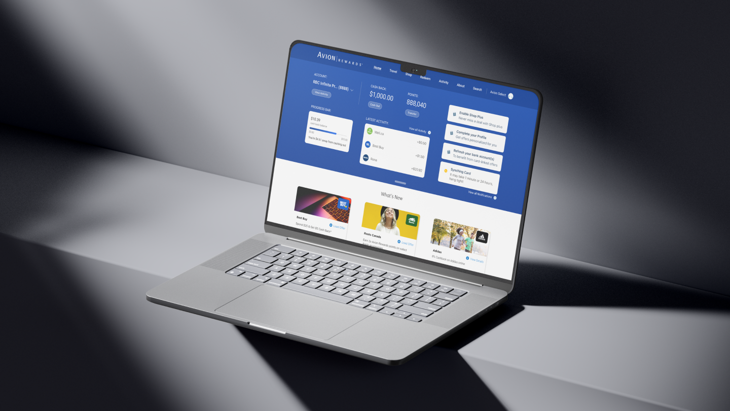
RBC Avion RewardsReimagining the Onboarding Journey

Cafe 360Omni Channel Enterprise Platform - Marketplace

HipoRecruitment Platform
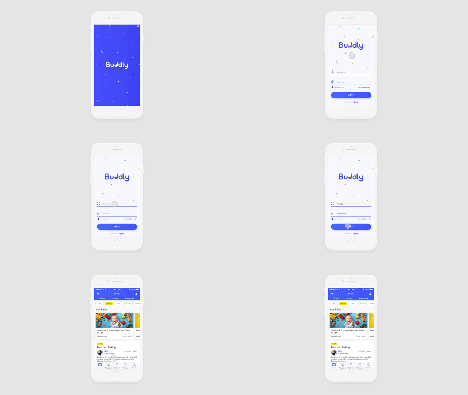
BuddlyCase Study
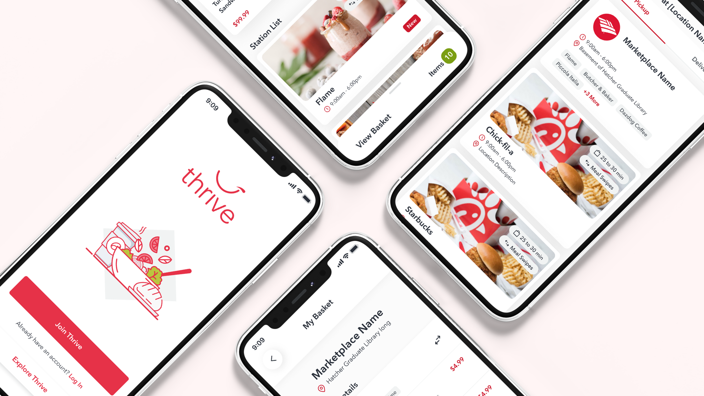
ThriveCafeteria Multi-Station Ordering

Admin Panel Sales AnalyticsEnterprise Platform Feature
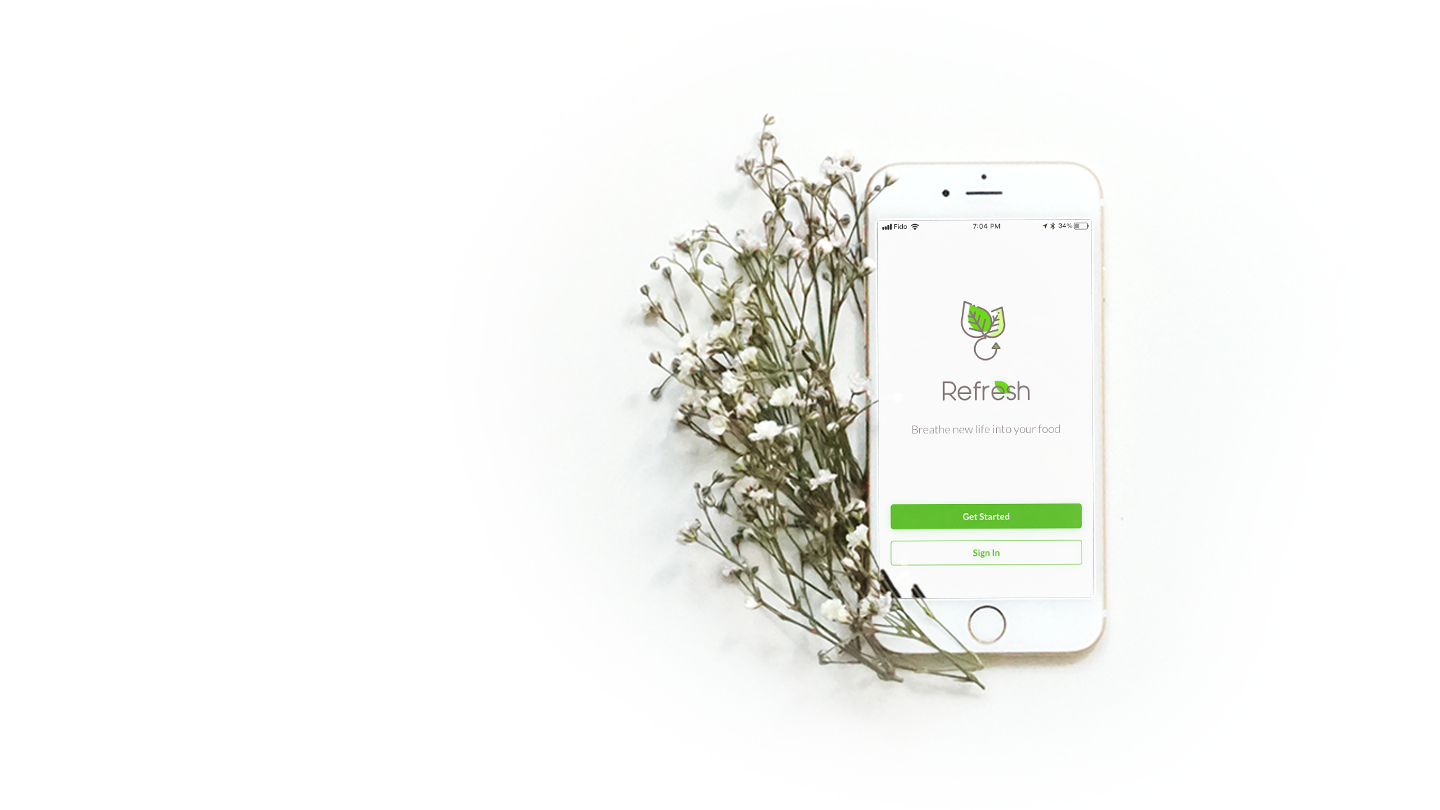
RefreshFood Waste - 1 Week Design Sprint
Thrive - LoyaltyUI Design

UI Design WorkMultiple Projects